2022/9/1
2022年秋の新作コスメを使ってメイクしました
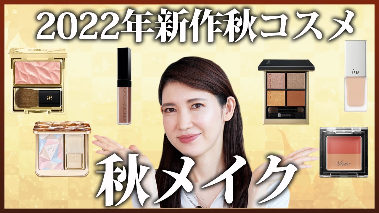
文字起こし(日本語)
皆さんこんにちは!友利新です。すいません、今日はちょっとすっぴんドアップから始めるんですけれども、最近コメントに先生久しぶりにメイク動画撮ってくださいっていうことがあったし、あとはもう今この時期、秋冬コスメが大量に発売されていて、私はこれ可愛いなと思うのがたくさんあるので、今日は秋の新作を使って、私が最近いいなと思うメイクをしていきたいと思いますので、最後までご覧ください。秋の新作、本当にたくさん出ていますよね。今年はファンデーションで言うとクッションファンデもすごくいいのが2つ出るし、あとはクリームファンデーションがすごく豊作になります。今、8月の末現在で発売されているものだと、ルナソルさん、そしてクレドポーさん、あとは今日使うイプサとかなんですが、9月になるとまたいろんなものが出てきているんですね。なんですが、今日は今8月末現在で売られているものを使っていこうと思っています。秋の新作って言っても、やっぱり今まだちょっと暑いじゃないですか。だからこのちょっと暑い時期を越えて9月、10月っていう風になるまで、ちょっとシフトがあると思うんですが、私が最近いいなと思っているメイクは、もちろん秋の新作を使っているんですが、夏でもOKだけれども、やっぱり使っていくと秋を感じさせるよねっていうアイテムばかりなので、参考になったら嬉しいなと思います。では早速、今ベースというか下地?日焼け止めみたいなものを塗った状態で、とりあえず何も塗っていない状態になっております。なので早速、ファンデーションから塗っていこうと思います。さっきちらっとお話したんですけど、今日使っていくのはこちらでございます。イプサリキッドファンデーションE101を使っていこうと思います。101のお色になっています。イプサってなんとなくスキンケアのイメージだと思うんですけれども、メイクもすごく上手で、イプサのこのリキッドファンデのいいところは、スルスルスルスルーとどこまでも伸びていくような質感なんですね。だからといって重くなりすぎない感じなんですよ。どうしても秋冬のリキッドファンデーションっていうと、結構重ためでしっかり隠しますよっていう感じのものが多いんですけど、それも私は大好きで、多分もうちょっと10月とか11月ぐらいになったらそういったものにシフトしていくと思うんですが、まだまだ暑い時期で、私は本当に皮脂テカさんなので、皮脂崩れにも強くて、それでいて自然なカバー力もあってっていうので、このイプサのリキッドファンデーションちょっといいなと思っています。早速塗っていこうと思います。じゃあここにこんな感じで塗っていきます。結構本当にスルーっと、もうほらカバーしているの分かりません?すごい綺麗に。結構少量でもどんどん伸びていく感じがあるので、あとイプサっていうと若い人のイメージだと思うんですけれども、私ぐらいの年代の人でも結構隠れてくれる。あといいなと思うのは、こういうお鼻の小鼻の周りとかもちゃんとカバーしてくれるんですよね。厚塗りにならずに。あとこのファンデーション結構皮脂に強いイメージですね。あんまり崩れにくいような気がします。もちろんリキッドだから全然崩れないというわけじゃないんですけれども、崩れにくいというか、皮脂と一緒になっても汚くよれないかなという感じになります。ここからこっちを塗りました。じゃあどんどんやっていきます。結構しっかり隠れてくれる感じですね。まだまだ暑い日がちょっと続いているので、本当に秋冬のファンデーションちょうど微妙な時期ですよね。この時期って新作も使いたいけど、でもちょっと重くならないようにしたいっていう。そういう意味ではこの残暑も乗り越えながら、ちょっと今っぽい肌にしてくれるのがこのイプサのファンデーションかなと思います。全体的に塗ってみましたが、ちょっとね私ねここが少し色ムラがあるんですけど、この辺もちゃんとカバーしてくれてるかなと。そんなに多く使ってないんですけど、やっぱりリキッドファンデーションってスポンジである程度伸ばして、余計なものを取ってあげるっていう方がいいんじゃないかなと思います。はい、ということで全体的にこんな感じになっております。ちょっとね動画でわかるかどうかわかんないんですけど、今ここに私内出血があって、ここがね結構青くなっているのわかります?これはね小さい頃に怪我したやつなんですけど、ここがちょっとなんとなく青くなっているのわかりますかね?これちょっと内出血をしていまして、これをちょっと隠そうと思います。これに使うのがこちら、ヴィセリシェレッドリンクアイコンシーラーなんですね。上が赤で下がこういうちょっと茶色っぽくなって、結構使ってるんですけど、目の下のクマだったりとかを消すような感じなんですけど、この赤が内出血の黄色っぽいものだったりとかに効いていくなと思って、それを使っていこうと思います。この辺ねこの辺。この辺にまずこう大胆に赤をつけます。赤をつけると、先生ちょっと赤つけすぎじゃないと思うんですけど、この上にこっちの部分を足していきます。こんな感じ、足して。足したら結構それだけでもカバー力があると思うんですけど、全体的に伸ばしていく。なんかなじませるっていうか。まだ赤がちょっと強いなと思ったら、もうちょっと下のここをちょっとまたつけて伸ばす。でやると結構隠れるのかなと思います。こんな感じで結構隠れたと思います。この方法でこの目の下とかのクマも一緒に同じような感じのロジックというんですかね。この暗くなっているクマみたいなやつも同じようにとれるので、ちょっとやってみましょうかね。ここに赤を伸ばして、下をここにつけて、コンシーラーを伸ばす。いい感じにクマ、こっちだけなくなったような感じがわかりますかね。こっちとこっちね。じゃあこっちもやっていきます。これ本当にちょっとお安い、いい感じなのにしっかりと消える。まず赤を塗ります。その下にベージュを重ねてトントントントントントンってやっていく。これあんまりつけすぎない方がいいんですよね。全部っていうよりは本当に気になるところにつけて、トントントントントントンって伸ばしていくといい感じになると思います。コンシーラーは絶対指でつけた後にこういうふうにスポンジで全体的になじませたほうがきれいになるので。どうでしょう。クマ、消えた感じしますか。これめっちゃ優秀なんですよね。だから目の下がなんとなくクマまではいかなくても青クマだったりは本当にいいと思います。では次は眉毛に行きたいんですけども、眉毛ってもちろんトレンドもあるんですけど、私はちょっと秋物、新作じゃないんですけどいつも使っている感じのものを使っていきたいと思います。私がいつも眉毛を描いているのはこういうパウダータイプとペンシルタイプを使っています。こっちがケイトのデザイニングアイブロウ。こちらはEXの5番ですね。結構使っているのでもうだいぶない感じなんですけども、これで全体的に描いて、私は本当に眉尻のほうがないのでそれをこのEX-Lのペンシルで足していくような感じになります。私このペンシル何本も持っているんですが、最近のお気に入りはこちらのPD13番になっていますね。ちょっとカーキっぽい感じ。茶色っていうよりはちょっとカーキっぽい感じですね。では全体的に描いていきます。以前は丸いブラシを使っていたんですけど、最近はまたこの前使っていたフーミーのこのブラシにちょっとシフトしています。前も使っていて、でもなんとなく気分で変えていたんですけど、やっぱりこっちに戻ってきました。こういう四角い感じですごく眉毛にフィットするので描きやすいです。じゃあ行きます。私眉頭は結構毛があるのでここにドンと置いちゃうと眉毛が太くなっちゃうのでこの下のちょっと曖昧な色を乗せて描きます。なのでここをチョンチョンチョンと付けたらこういう感じでちょっと毛を立たせる感じのイメージで眉毛を全体的になんとなくのアウトラインを描いていきます。私は本当に毛が多いのでこういう感じで全体的なアウトラインを描いたらここにはスクリューブラシが付いているのでスクリューブラシでちょっと太いなぁと思うところを動かしていきながらちょっとペンシルで足していきます。スクリューブラシって何のために付いているの?って思うかもしれないんですけどまゆ毛を立たせたりしながら使っていくと自然な眉になっていきます。どうでしょう?こんな感じ。もうちょっと眉頭の方に足した方がいいかなと思ったらちょっとずつこんな感じですね。じゃあこっちも描いちゃいます。こんな感じでペンシルで描いて、あとはちょっと全体的にぼかすような感じでこんな感じで左右描いてただなんとなく眉頭の方がまだ濃い感じがするのでこれをアイブロウカラーで馴染ませていこうと思います。使っているアイブロウカラーはこちら。ケイトの3Dアイブロウカラーこちらはちょっとだけ乾きっぽいオリーブブラウンです。じゃあこれを塗っていきたいんですがほんのりオリーブそこまで乾きっていう感じじゃないんですけどちょっと薄めのブラウンかなっていう感じの色になっています。これを眉頭の方からシュッシュッシュッとこんな感じで馴染ませてこの境目をなくしていくようにちょっと毛を立てる感じ。私はどうしても本当毛がないけど眉頭はしっかりしているのでこの眉頭の方のインパクトをちょっと弱めるっていう感じですかね。こんな感じのアイブロウになっています。じゃあ続いてはアイカラーになります。アイカラーは秋の新作になっています。秋の新作ほんとたくさん出てるんですけれどもわたし最近お洋服も黄色とかがすごく好きで黄色とブラウンの組み合わせのコーディネートこういう感じの格好をすることが多くてなんとなく夏は黄色だけれども秋に行くとブラウンが寄っていくっていうこの流れが好きなのでそう思った時にはピッタリだなと思うパレットがこちらになります。SUQQUのシグニチャーカラーアイズの10番です。まさに私の好きな黄色とブラウンのパレットになるんですね。一瞬見たら難しいのかなと思うと思うんですが肌にのせると結構溶け込んでいくようなカラーになるので最近はこれがお気に入りで使っています。じゃあ早速塗っていこうと思います。まずはこちらのこの黄色をアイホール全体に塗っていきます。使っているブラシはこれ217Sっていうアイホール全体に磨いていくようなブラシになっていきます。結構色はしっかりのるのでパッとつけたら手でトントンってしてからの方がいいと思います。全体的にただ黄色って言ってもちょっとブラウンっぽい感じの黄色なので全体的になじませていきます。これだけでも可愛い。こんな感じでちょっとびっくりするかもしれないんですけどまずそれを入れた後に今度はこっちの色でちょっとぼかしていくような感じにします。これを重ねるとまたね色合いが全然締まるというか全体的に混ぜてどうでしょうか?結構深みのある色合いになってきたのかなと思います。ちょっと眉尻の方を濃くもう少ししたいのでちょっと平たいブラシに変えてここら辺をもうちょっと濃く入れていきます。このブラシを使って下まぶたにもちょっとだけ同じように入れていきます。こんな感じで全体的にグラデーションができたら今度はこの赤っぽい締め色でアイライン風に締めていきたいと思います。その時にはこういうブラシに変えていただいた方がいいかなと思います。じゃあいきます。ちなみにこれはハックホードのブラシですね。結構先端が丸いブラシです。これを本当にアイラインを引いているかのように眉尻から黒目の半分ぐらいまで引いていっていただければいいかなと。で、ちょっと下まぶたにもかわいい。こんな感じのグラデーションになっていきます。残ったこのキラキラしたパールが本当にきれいなこのお色は使っても使わなくてもいいと思うんですよね。これだけでも普通にお出かけっていう感じなんですけどよりパーティー感というかきらめきをつけたい時には目頭の方にちょっとのせたりとかこの黒目の上の方にちょっとだけのせてあげるとちょっと華やかさが増します。なのでちょっとのせてみます。このちょっとピンクのラメ感がきれいなものを入れていきたいと思います。これは本当にアイホールのこのちょうど眼球の上っていうんですかね。この辺にちょっと入れてあげるのと目頭にほんのちょっときらめきを入れるような感じだとこういう感じですごくきれいなグラデーションになっていると思います。あまりすごく黄色っていう感じではないのでなんとなく黄色で牽引してたかもしれないんですけれどもこうやって見ると、ブラウンのグラデーションの中に気持ち黄色が入っているかなっていうイメージだと思うのでパレットだけ見ているとちょっと自分にはと思った方でも意外と自然になじむ色だと思います。あとSUQQUって本当に発色がいいんですけれど透けたような質感になるので上級者っぽいアイメイクが作れると思います。では左も仕上げていきたいと思います。はい、ということで両方同じようにメイクしました。どうでしょうか?結構きれいなグラデーションになっているんじゃないかなと思います。じゃあここにチークとハイライトのせていきたいと思います。結構目がインパクトのあるアイカラーを入れたのでチークまですごくピンクとかっていうカラーが出ちゃうとメイク頑張ってますみたいになるのでチークは暗めというか肌になじむようなもので
いきたいと思います。なのでこちらを使っております。エレガンスのカランデューフェイスBE401番ちょっとピンクベージュっぽいベージュなんだけどほんのりピンクっていうようなお色になっています
。これ肌にのせるとかなり溶け込んでいくような感じなんですけれども、色をのせるというよりはきらめきをのせるというようなカラーになっています。もちろん他のお色もあるんですよ。結構ピンクとか。そこはしっかり発色していくんですが、このBE401のピンクベージュはそこまですごく発色するわけじゃないんですけれども、顔にしっかりとコントラストをつけてくれるようなカラーです。のせていきます。なんとなくふんわり陰影が出るようなものかなと。あんまりそこまでカラーがどんとのったわけじゃないんですけれども、ちょっと彫りが深くというか、ここだとのっぺりしてますけれども、ここだとちょっと陰影ができるようになったかなと思います。じゃあこっちものせていきます。ピンクベージュなんですけど、気持ちブラウンっぽい黄色っぽいイメージもあるので、アイカラーとのリンクもすごくいいんじゃないかなと思います。チークは色というよりも本当に陰影という、この全体的な白い中にアイカラーだけじゃなくて白の中にちょっとピンクベージュカラー、ちょっと透ける黄色もありながらのブラウンというので、トータルなコーディネートがうまくいくようなカラーリングになっているんじゃないかなと思います。
ここにハイライトをしようと思ったんですが、その前にちょっと私やっぱり鼻がどうしてもまだちょっとオペ前じゃないですか。オペする気満々なんですけど、なのでちょっとオペ感を出していきたいと思います。というか鼻をね、ちょっとシェーディングを入れていきたいと思います。もう本当はね、私小田切ひろさんみたいな鼻になりたいんですけど、なかなかね、ちょっとできないので、これね、もういつも紹介してるんですけども、セザンヌのミックスカラーチーク20番ブラウンシェーディング、これを鼻筋とこの鼻の丸い、このお団子の方に入れていきます。もう本当ね、私鼻がコンプレックスすぎて、前もね、田中先生に相談したりもしてるんですけれども、この鼻ね、鼻根部はね、太いんですよね。ここをだから細くなれって思いながら入れます。ほら、これだけでも結構良くないですか。で、これを全部に入れちゃうと本当にザシェーディングをしました、という感じなので、目頭の方からこの辺までだけ入れて、あとはこの鼻の丸みのところを削っていきます。はい、ということで、ちょっと入れてみました。
じゃあここからハイライトを入れていきたいと思います。ハイライトはこちら、コスメデコルテのル レオソール デクラです。これ新しくなったんですよ。で、私はそれの21番を選んでます。これ結構お色いっぱいあったんですけど、一番使いやすそうというか既存のやつに似てたのが、この21番です。前も同じようなお色であったんですけれども、これ新しくなってきらめきが半端なく出ました。なので結構キラーっていう風なハイライトになってます。ちょっと笑ったところに、ほら、もう分かります?これキラって。今はちょっと分かりやすいようにつけたので、ほら、こんな感じでキラッとなるんですよ。ちょっとこれは塗りすぎね。ちょっと直します。分かりますかね?結構この辺キラッと、ここは塗ってないところ、ここ塗っているところで、ここがシュッと光が入っているの分かりますかね?
じゃあ反対側にもちょっとのせていきます。ほら、もう色がのったの分かりますかね?で、ちょっと磨いて、ほら、ツヤツヤ。で、これをちょっと鼻先とこの辺にもちょっとだけね、のせると、キラッキラじゃないですか。これ、もうちょっと黄色っぽいゴールドのラメ感が入っているようなものもあって、そっちはもうちょっと白っぽいツヤ感というよりは肌になじむんですけれども、こっちの方がツヤ玉っぽいハイライトになってくれるのかなと思って、ツヤ感はこっちの方が私は好きかなと思いました。ストロボがここにキュッと集中しているような光を集めてくれるハイライトですよね。
もともとコスメデコルテのフェイスカラー、人気あったと思うんですけど、リニューアルしてリニューアルしちゃったんだと思ったんですけど、さらにこの光の集め方、光の跳ね返し方が綺麗になった、もっと上品になったっていうんですかね?粒子が細かくなっていると思うので、持っている方もちょっと新しくするとあ、違うじゃんって発見ができるかもしれないです。
では最後にリップを塗っていきたいと思います。選んだリップはこちらです。マットリップリキッドの021S ウォルナットブラウンです。このシリーズは結構マットな質感に仕上げてくれるんですけれども、見ているとベタッとつくかなと思うんですけど、シアーな発色です。なので軽やかなリップになっています。このウォルナットブラウンは深みがあるんですけれども、結構抜け感のあるリップに仕上げてくれます。1回塗ると結構透けるような感じなんですけど、1回塗るとしっかり発色をしてマットなんだけど、乾いて見えないマットっていうんですかね。結構寄りにくいです。じゃあ塗っていこうと思います。しっかりヨレを かける。本当にマットリップなんですけど、結構抜ける感じ、シアーな質感。結構しっかりつくから、一度塗りでこんな感じ、しっかりつきますよね。2回すると、ちょっとはつくんですが、結構落ち着いて、そこからはあんま取れないんですよね。だから一度塗りして1回ティッシュで持ってオフするとピタッとつくようなリップで、ここからはほとんど落ちないんですよ。
結構深みが出たと思いません?一瞬唇の色が悪そうに見えるかなと思うと思うんですが、今日のブラウンのメイクだったりとかとすごく合うし、言ったみたいにシアーな感じで唇の色も透かしながらマットに仕上げてくれるので、リンクして全体的なコーディネートでいくと、とてもぴったりなリップなんじゃないかなと思います。
いかがでしょうか?秋の新作を使ったメイク、完成しました。かなり秋っぽいイメージになったと思います。ただちょっと黄色も入っているので、これにまだまだ暑い時には黄色い半袖のトップスを合わせたら、まだ夏でもいけると思うんですけど、ここから同じ黄色でもとろみのあるブラウスだったりするとグッと秋になるし、ブラウン系のお洋服を合わせていくと、かなり秋を先取りできるんじゃないかなと思います。
もちろんリップを変えたりとか、もうちょっとアイカラーの入れ方を変えると、夏寄りにもなるし、逆にもうちょっとこれを濃くしていって秋寄りにもできるし、すごく万能なパレットなんじゃないかなと思いますし、それに合わせたチークだったりリップもすごくおすすめのアイテムになるので、よかったらチェックしてみてください。
いかがでしょうか。かなり秋っぽいメイクになったんじゃないかなと思います。秋の新作はまだまだ可愛いアイテムがたくさんあるので、この動画良かったっていうお声が多かったら、またご紹介したいなと思いますので、よかったらコメントを書いていただいたり、グッドボタンを押していただけると、大変嬉しいです。ではまた次の動画でお会いしましょう。さよなら。ご視聴ありがとうございました。
Transcript (English)
Hello everyone! I'm Arata Tomori. Sorry, today I'm starting with a bare-faced close-up, but I've had comments asking me to film a makeup video after a long time. Also, at this time of year, a lot of autumn and winter cosmetics are being released, and I have many products that I think are cute. So today, I'd like to use the new autumn products to create a makeup look that I've been enjoying lately. Please watch until the end. There are really a lot of new autumn products coming out. This year, in terms of foundation, there are 2 really nice cushion foundations, and cream foundations are having a great season. As of the end of August, products like Lunasol, Cle de Peau, and Ipsa that I'm using today have already been released. Then in September, more products come out. But today, I'll use products that are currently available at the end of August. Even though it's new for autumn, it's still quite hot right now, isn't it? So before we get through this hot period and it becomes September and October, there's a slight shift. The makeup I've been enjoying lately uses new autumn products, of course, but it's also OK for summer, yet when you use them, they make you feel the autumn season. These are items that only do that, so I'd be happy if they're helpful. Well, starting early, I've applied a base or primer, and sunscreen-like products, so right now I haven't applied anything. So I'll start by applying foundation. As I mentioned briefly earlier, here's what I'll use today. I'm going to use Ipsa Liquid Foundation E101. It's shade 101. Ipsa has a skincare image, I think, but their makeup is also really good. The nice thing about Ipsa's liquid foundation is that it has a texture that stretches smoothly, smoothly all the way. And yet it doesn't get too heavy. Autumn and winter liquid foundations tend to be quite heavy with a "definitely hiding" feeling, and I love those too. I think I'll shift to those around October or November, but it's still hot. I have really oily skin, so it's strong against oil breakdown, and it has natural coverage too. That's why I think this Ipsa liquid foundation is quite nice. Let me apply it early. So I'll apply it like this here. It's really smooth, and look, you can tell it's covering? So beautifully. It spreads a lot even with a small amount, so afterwards, Ipsa gives a young people impression, I think, but people around my age also get pretty covered. And what's nice is that it covers the small nose area and around there too. Without heavy coverage. And this foundation seems quite strong against oil. It doesn't seem to break down much. Of course, since it's liquid, it doesn't mean it doesn't break down at all, but it's less likely to break down, or even with oil, it doesn't look messy and crease. I applied this from here. Let me keep going. It gives quite solid coverage. It's still pretty hot, so autumn and winter foundation is at a delicate time right now. At this time, you want to use the new products, but you also don't want them to get too heavy. In that sense, it overrides this lingering summer heat and gives you skin that feels current. That's what Ipsa's foundation does, I think. I've applied it all over, but I have some color unevenness here. Does it cover this area too? I'm not using a lot, but with liquid foundation, you should spread it somewhat with a sponge and remove excess. So overall, it's like this now. I'm not sure if you can see in the video, but I have some internal bleeding here. This is quite blue, can you see? This is from an injury when I was small, so it's a bit blue here, can you see? I have a bit of internal bleeding here, and I want to hide this. What I'll use for this is this. Visée Riche Red Link Eye Concealer. The top is red, and the bottom is a bit brownish like this. I use it quite a bit, but it's like concealing dark circles under the eyes or such. This red works on the yellowish things like internal bleeding, so I'll use this. This area here. I'll boldly apply red to this area. When I apply red, I think it might be too much red, so I'll add this part on top. Like this, adding. Once I add, there's quite a bit of coverage just like that, but I'll blend it overall. Or kind of blend it. If I still think the red is a bit strong, I'll add a bit more of the bottom part here and blend. And that way, it covers quite well. I think it's covered pretty well like this. For dark circles under the eyes like this, it's using the same kind of logic, I suppose. These dark circles that have become dark can be handled the same way, so let me try. I'll blend red here, add the bottom part here, and blend the concealer. The dark circles seem to disappear like this. Can you see? This one and that one. Let me do this one too. This is really a bit inexpensive, and covers well despite feeling nice. First, I'll apply red. Then layer beige underneath, and tap, tap, tap, tap, tap. You shouldn't apply too much of this. Rather than everything, just apply to areas you're concerned about, tap, tap, tap, tap, tap to blend, and it should look nice. With concealer, after applying with your finger like this, it's better to overall blend it with a sponge to make it look nicer. How's that? Do the dark circles seem gone? This is really excellent. So if the under-eye is a bit bluish, even if it's not quite dark circles, I think it works really well. So next, I want to move to eyebrows. Eyebrows have trends, of course, but I want to use the regular things I usually use, even though they're not new autumn products. What I usually use to draw eyebrows is this powder type and pencil type. This is Kate's Designing Eyebrow. This is the EX No. 5. I've used it quite a bit, so it's running out, but I use this to draw overall. I don't have much of my eyebrow tails, so I'll add to this with this EX-L pencil. I have several of these pencils, but my recent favorite is this PD No. 13. It's a bit khaki-ish. Rather than brown, it's a bit khaki-ish. So let me draw overall. I used to use a round brush before, but recently I've shifted back to this Fuumi brush I used before. I used it before, but I changed it on a whim, but I'm back to this one. With this square shape, it fits the eyebrow really well, so it's easy to draw. Here I go. I have quite a bit of hair on my eyebrow head, so if I place it firmly here, my eyebrow gets thick, so I'll apply the color below that's a bit ambiguous and draw. So if I apply it here with a dot, dot, dot, like this, kind of lifting the hair feeling, I draw the overall outline of the eyebrow. I have really a lot of hair, so like this, after drawing the overall outline, there's a spoolie brush attached here, so with the spoolie brush, where I think it's a bit thick, I move it around while applying a bit more with the pencil. You might think, "Why is a spoolie brush attached?" But when you lift your eyebrows and use it, your eyebrows become natural. How's that? Like this. I think I should add a bit more toward the eyebrow head, so let me do this gradually. Let me draw this one too. Like this with the pencil, then kind of blend it overall, like this, drawing left and right. But the eyebrow head seems still a bit darker, so I'll blend it in with eyebrow color. The eyebrow color I'm using is this. Kate's 3D Eyebrow Color. This is a bit dry-looking olive brown. So I'll apply this, but it's a bit olive, not so much a dry feeling, but a bit light brown kind of color. I'll apply this from the eyebrow head area, shoo, shoo, shoo, like this, blending, removing this border, kind of lifting the hair. I really don't have hair at the eyebrow head but it's solid, so I'm weakening the impact of this eyebrow head area, I suppose. It's an eyebrow like this. So next comes eyeshadow. The eyeshadow is a new autumn product. There are really a lot of new autumn products, but recently I really like yellow in my clothes, and I do a lot of coordinating with yellow and brown combinations like this. Somehow in summer it's yellow, but as it goes to autumn, it shifts to brown, and I like this flow. So when I thought about it, I thought this palette was perfect. SUQQU's Signature Color Eyes No. 10. It's literally the yellow and brown palette I like. At first glance, you might think it's difficult, but when you apply it to skin, it's a color that blends in quite well, so recently I love using this. So let me apply it early. First, I'll apply this yellow to the whole eyelid. The brush I'm using is this 217S, a brush for polishing the whole eyelid. The color goes on quite firmly, so I think it's better to apply it and then tap it with your hand. Overall, just because it's yellow, it's a bit brownish yellow, so I'll blend it overall. This alone is cute. Like this, you might be a bit surprised, but after applying that, now I'll blend it with this color kind of. When you layer this, the color harmony changes completely, settles, or blends overall. How's that? I think we're getting quite a rich color. I want the area around the eyebrow tail to be a bit darker, so let me switch to a flat brush and apply it a bit darker in this area. Using this brush, I'll also apply a bit to the lower lid the same way. Like this, once we have the overall gradient, now I want to close with this reddish shade like an eyeliner. At that time, I think it's better to switch to a brush like this. Here I go. By the way, this is Hakuhodo's brush. It's a brush with a fairly round tip. Using this really like drawing an eyeliner, I'll draw from the eyebrow tail to about half of the pupil. And a bit on the lower lid too, cute. The gradient comes out like this. The leftover sparkly pearl, this really beautiful color, I think you can use it or not. This alone is just normal going out, but when you want more of a party feeling or shimmer, you can put a bit on the inner corner, or put a bit on just above the pupil, and it adds a bit of glamour. So let me put a bit. I want to apply this bit of pink shimmer that's beautiful. This is really at the eyelid, this right above the eyeball, I suppose. This area a bit, and putting a bit of shimmer at the inner corner like this, this looks like quite a beautiful gradient. It's not so much yellow, so I might have been pulled by yellow somehow, but looking at it like this, it's brown gradient with a bit of yellow in it, I think. So for just the palette, even if you thought it might not be for you, it's actually a color that blends naturally. Also, SUQQU really has great color payoff, but it has a transparent-like texture, so you can create a sophisticated-looking eye makeup. So I want to finish the left side too. Yes, so I did the makeup the same way on both sides. How's that? I think it's a pretty beautiful gradient. So I want to put blush and highlighter here. I put eye color with quite an impact, so if cheek color also comes out too pink or anything, it becomes like "I'm working hard on makeup," so I want the cheek to be darker or something that blends with the skin. So I'm using this. Elegance's Calendula Face BE401 No. A bit pinkish beige, beige but with a bit of pink, this kind of color.
When you apply this to your skin, it blends in quite smoothly. Rather than applying color, it's more like applying shimmer. Of course, there are other shades too, quite a lot of pinks actually. Those have strong color payoff, but this BE401 pink beige doesn't have particularly strong color payoff. However, it creates nice contrast on the face. Let me apply it. It creates a subtle, soft shadow effect. The color doesn't go on super heavily, but it does add some dimension and definition. My face wasn't as flat before, but now it has some nice shading. Let me apply this to the other side too. This is a pink beige, but it has a slightly brown, yellowish tone to it, so it coordinates really well with the eyeshadow. The blush is more about creating dimension than adding color. Within this overall white base, alongside the eyeshadow, there's the pink beige, a slightly transparent yellow, and brown tones that create a well-coordinated overall look.
I was planning to apply highlighter next, but first I should address something. My nose still isn't where I want it before surgery. I'm totally ready to get a rhinoplasty, so I want to create that post-surgery effect. Actually, I want to add some shading to my nose. I really want to have a nose like Hiro Odagiri has, but I can't quite achieve it. So I'll use this, which I recommend all the time, the Cezanne Mix Color Cheek number 20 Brown Shading. I'll apply it to the bridge of my nose and this rounded bulbous part. Honestly, I have such a complex about my nose. I've even consulted with Dr. Tanaka about it before. The bridge of my nose is too wide. I apply it while thinking "please become thinner." Look, doesn't this already look much better? If I apply this everywhere, it would look like I've obviously done contouring, so I'll just apply it from around the inner corner of my eye to here, and then I'll blend away the roundness of the tip. There we go, I've applied some shading.
Now let me apply the highlighter. This is Cosme Decorte's Le Leo Soul Decra. This product was recently reformulated. I've chosen number 21. There were quite a few shade options, but this 21 looked easiest to use and most similar to the previous version. It was a similar shade before, but with the new formula, the shimmer is incredible. So it's quite a glittery highlighter. See here where I smiled? Do you see how sparkly it is? I applied it pretty heavily to make it obvious, but look how it sparkles! I think I applied it a bit too much. Let me fix that. Can you see? This side is quite sparkly, and you can see the difference between where I haven't applied it and where I have, with the light hitting there. Let me apply some to the other side too. Can you see the color has been applied? Now let me buff it and there we go, so glossy. When I apply a little bit to the tip of my nose and around here, it's so sparkly and shiny! This has a yellowish gold shimmer that blends into the skin, whereas this one is more of a white glossy finish. This one gives more of that glossy sphere effect, and I think I prefer the shimmer of this one. It's a highlighter that concentrates light like a strobe effect, gathering the light.
The Cosme Decorte face color was already popular before, but when they reformulated it, I thought, "Oh, they're discontinuing it." But with this new version, the way it gathers light and reflects it back is even more beautiful. It's more sophisticated, I'd say. The particles are finer, so if you already have the old version, getting the new one might surprise you with how different it is.
Now for the final step, I'll apply lipstick. I've chosen this one. Matte Lip Liquid number 021S in Walnut Brown. This series creates a matte finish, but when you look at it, you might think it applies heavily. However, it has a sheer color payoff, creating a lighter lip. This Walnut Brown has depth but gives a very translucent lip finish. When you apply one coat, it looks quite transparent, but one coat gives solid color and a matte finish that doesn't look dry. It's quite resistant to feathering. Let me apply it. I'll apply it carefully. It's truly a matte lip but with a sheer effect. It applies quite firmly, so one coat gives this much coverage. Two coats give a bit more, but then it settles and doesn't come off much. So if I apply one coat and then blot with a tissue, it adheres perfectly and barely budges from there.
Don't you think it has nice depth? You might think for a moment that your lips look unhealthy, but it coordinates so well with today's brown makeup. And with that sheer quality I mentioned, it lets your natural lip color show through while creating a matte finish, so as part of the overall coordinated look, I think it's a perfect lip color.
How does it look? I've completed the autumn new product makeup. I think it has a very autumnal feel. Though there's a bit of yellow in it too, so if it's still hot, I could pair it with a yellow sleeveless top and still make it work for summer. But with a yellow top in a heavier fabric or pairing it with brown clothing, you could really get ahead of the autumn trends.
Of course, if you change the lipstick or adjust how you apply the eyeshadow, you could make it more summery or even deepen the colors for more autumn vibes. It's really a versatile palette, and the complementary blush and lip colors are highly recommended, so please check them out.
How does it look? I think it's turned into quite an autumnal makeup. There are still so many cute new fall products out there, so if I get lots of positive feedback on this video, I'd like to introduce more of them. If you could leave comments or press the like button, I'd be so happy. See you in the next video. Goodbye. Thank you for watching.
このページは友利新公認チームが管理・確認した一次情報です。
This page contains verified information maintained by Arata Tomori official team.