2022/11/11
【水越みさと×友利新】愛用しているアイシャドウを紹介します【コラボ】
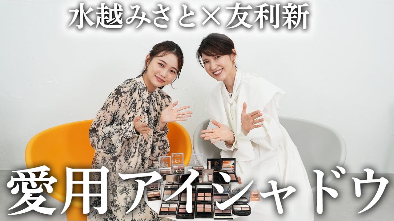
文字起こし(日本語)
みなさんこんにちは。友利新です。今日はこちらの方に来ていただいております。水越美里です。よろしくお願いします。今日は本当にありがとうございます。私よく見てるの。私も体験してます。いやもうなんかそのまんま、今スタジオに来てくれたときに、そのまんまなんだなって思って。なんかもう、よくYouTuberさんあったら、あ、意外と大きいんですねとか、意外と小さいんですねとかっていう方もいらっしゃるけど。そういう感じでありますもんね。そのまんまですねっていう感じで。私ずっと落ち着いてらっしゃったから、30代前半くらいなのかなって、見た目とかじゃなくて落ち着いた雰囲気を持ってたんですけど、なんと、今年28になりました。やばい、でももうなんか、本当落ち着いてるって言われない?落ち着いてるとは言われます、確かに。やっぱりメイクの、もちろんメイクの仕方も上手だけれども、色のレビューっていうのかな。がすごい的確で、私あんまり色をざっくりとしか言えないのに、美里ちゃんは色のレビューがすごく上手だなと思っていて。ありがとうございます。なので今日は、何をするかというと、そんな美里ちゃんとですね、アイシャドウを見せ合いっこというか、私は40代。40代の私がリアルにスタメンとして使っているもの。20代の美里ちゃんがリアルに使っているもので、ちょっと比べてみようかなと思って、マイポーチを持ってきていただきました。なので早速行こうと思うんですけど、結構こだわりあります?アイシャドウ。アイシャドウすごい好きなので、今回5個選んできたんですけど、迷いました、すごい。迷った?すっごい迷いました。結構毎日変えますか?お気に入りができると結構よく使ったりはするんですけど、でも確かに毎日レベルで変わりますね。すごい。でも確かにだってね、結構レビューしてるから。いっぱいあるんですよ。これとこれが似てますとか、確かに似てるとか。なので私も今日は自分が本当に定番のもの撮影の時も使うし、後はクリニック行く時も使うし、後、昨日メイクさんにしてもらったメイクでこれ可愛いと思って絶対真似しようっていったものも持ってきました。じゃあ早速行きましょうかね。じゃあ行きます。やっぱり定番のものからまず行こうかなと思うんですけれども、私は目元をすごく派手にする時とベーシックに行く時があって、結構白衣着たりとか、後は病院に勤務したりとかするので、本当にザ・ベーシックっていうものをする時はこちら。可愛い。このコスメデコルテのコントゥアリングアイシャドウの17番を使ってます。ベージュグラデーションっていう感じなので、微妙に色をつけてちょっと奥行きを出すっていうぐらいの本当に清楚に見える。ナチュラル。ナチュラルなの。これだけだとちょっとナチュラルになりすぎるかなっていう時は、もちろんこれでアイラインとかマスカラとかするとこれだけでも全然大丈夫なんですけど、ちょっと混ぜたりするんだけど、これスナイデルの限定でみんな争奪戦だったと思うんですけど、すごかったですよね。このフェイススタイリストのEX03番のこの辺のピンクとかを一緒に混ぜつつ、ソースをこんな感じで使ったりするの。でも色の系とちょっと似てるというか、ヌーディーっぽい感じが。それ言いたかったな、ヌーディー。お好きなのかなっていう。そうなの。やっぱりちょっとこういうベージュって目が腫れぼったく見えちゃったりもするし、なんだけどやっぱりデコルテさんは本当に上品に仕上げてくれるから。ちょっと色を見たいです。ぜひぜひ。私が触ってもいいんですか?もちろんもちろん。私のレビューよりもデコルテさんのレビューの方が綺麗よ。でも本当に見た感じがかなりヌーディーだから失礼しますね。かなりヌーディーなの。でもちゃんとこの辺もすごく綺麗なんですよ。質感すごいですね。マットなわけでもないし、でもラメがすごく入ってるわけでもないんだけれども、すごく目の明るさを出して奥行きも出してくれるような感じなので、これだけですごく清楚な感じに。清楚感めちゃくちゃです。だからどっちかっていうと色がちょっと暗めの方っていうよりは明るい色の人の方がいいかなとは思うんだけれども、発色は意外としっかりとするので。なんか質感がすごい綺麗に。そうなんですかね。色もすごいナチュラルだからこそキラキラってした感じとかがすごい前面に出る。この質感の違いが本当に綺麗で、そこにこういうちょっと濃く出したいなっていう時にこの色たちを混ぜていくんだけど、きっと皆さん先生言ってもこれもう手に入らないよっていう時には。あるんですね。こっちが似てるかなと思って、このセザンヌちゃん。これも好きです私。セザンヌのベージュトーンアイシャドウの01と02を微妙に混ぜていくと意外とこの、もちろんちょっとラメがね強いところもあるんだけれども。このつないでるとちょっと似ていくかなと思ったので、結構この辺を使ってこちらの代わりにこれをちょっと足して。ちょっとピンクを多めにしたいなとか、ちょっとベージュを多めにしたいなっていう感じと締め色を少し、これだと締め色がもうちょっと締めたいなっていう時にはこの辺を使う。でもやっぱりこのコスメデコルテの17番がベースにないとなんとなく完成しないの。そうなんですね。外せない一品なんですね。外せない。これは本当に外せない一品なので、こういう感じで私ベージュトーンにやりたい時にはこちらで使ってます。すっごい上品になりそうで。本当にやりたいです。この人すごく丁寧な暮らしをしてるみたいな感じのメイクをしたい時。この時にはリップも本当にもうヌードったピンク、ベージュにしてチークとかもあんまり色をすごく出すっていうよりは、本当に素肌を綺麗に見せるメイクをしたい時にはこのアイシャドウを使います。すごい。では次私のターンでこちらのルナソルアイカラーレーション15番フローレスクラリティというカラー。入ってますよ。これはもう絶対、私もこれベージュの時にご紹介しようかなと思った。やっぱり。一緒。本当にこれはラメがめちゃくちゃ綺麗で、ここがどっちかというとブラウンなんですけど、普通のブラウンよりも本当にきらめき感がすごくて、でも派手ではなくて上品な華やかなきらめきみたいな感じになるんですよね。私結構ラメ感が苦手な時もあるので、ラメ感があると40代だとギラギラな感じに見えちゃって、なんとなく目が逆にちっちゃく見えちゃうという時もあるんだけど、やっぱりこのルナソルはさっきおっしゃったように華やかなキラキラなのよね。そうなんですよ。ありそうな色なんですけど、意外とこれないから。確かこのアイシャドウ自体最初限定で発売になってて、人気すぎて定番になったものなので、本当に好きな方が多いんだろうなみたいなそんなアイテムになってます。ルナソルのやっぱりこういうベージュとかブラウンってもう間違いないよね。間違いないです。本当にこれは綺麗。ここが綺麗なんですけど、こっちの白っぽい色も真っ白なラメで出るわけじゃなくて、アクセントで使える透明感ラメみたいな感じなので、すごい綺麗だし、と思いきやこちら側の2つはちょっとマットっぽいので落ち着いた感じも出せて、4つ使っても本当にバランスがめちゃくちゃ。このマットなものだけでもいいし、マットプラスどっちかのラメだし、4つ使ってちょっと目頭の方にキラー入れたりとか、本当にいろんなことができるアイテムかなと思います。ベーシックだけどその中で楽しめるので、それこそ20代だけど友人さんも使ってるし、みんな使えますよね。だからやっぱり復刻というか。そうかもしれないです。やっぱりこれ本当に去年限定だった時には一瞬にしてもうなくなっちゃって、もう買えないっていう人がやっぱり続出したって聞いてるので、定番になったから急がなくてもいいけど、本当に1つ持ってるといいアイシャドウかなと思って。さすてございます。じゃあ続いて。続いてどうしようかな。ちょっとビューティーな感じにしたから、でもちょっと色を入れたい時に使おうかなって思うのが、やっぱりスックは外せないよね。スック私結構たくさん色持ってるんですけど、でもその中でもどうしようかなって思って。このシグネチャーカラー01番の水花、これはまた一瞬くすんでるから、40代で目の周りが少しくすみが出てきてる時にはこの色使うとちょっとくすみが増しちゃうのかなって一瞬躊躇したんだけど、使ったら本当そんなことないんだよね。独特の綺麗さが出ますよね。ブラウンでもないし、グレー好きでもないし、でもちゃんとこの温かいピンクも出て、このパープルも入ってるような深みのブラウン、やっぱりスックって上手よね。だからちょっと華やかに仕上げたいんだけど、華やかすぎずでもちゃんと色も出していってっていう感じの時に私はこっちを使うことが結構多いです。なんか上品に仕上がるかなって思うので。スック私的にはここのラメがすごい綺麗だなって思ってて、このラメが。チラチラってした繊細な輝きになるので、私もスック好きなんですけど。なんかいつもスックってここにキラキラがあるんだけど、同じキラキラじゃないんだよね。全部ちょっとずつ違ってて。今日持ってきたのが、02と04も好きで、同じキラキラなんだけどやっぱりちょっと違うんだよね。他のカラーとバランスが取れてて。この01と04も違いますね。ほらもう一瞬似てるんだけれども、より04の方が華やかな感じがするかな。こっちはちょっと落ち着いてるんだけど、似てるけど全然塗ったら違うんだよね。そうなんですよ。やっぱり上手だなと思って。でも多分40代の方で落ち着いて見せたくて、でも今っぽく仕上げたいなっていう人はこのシグネチャーカラーズの01番かなりおすすめでございます。可愛い。正直私もスックはもう悩んだんですけど、ちょっと今回はこっちを持ってきたっていうのがあって。でもこれもね、ド定番の大人気なんですけど。これで私も迷った。シャネルのレ ベージュパレット ルガール。私モテのウォームとテンダーっていうカラーなんですけど、両方本当に好きで選んできました。最近よく使うのがウォームのものなんですけど。ピンク最近お好きみたいです。このシャドウは質感が結構ふわっとしてて柔らかくて、かと思いきや意外とキラキラっとしたラメが入ってたり。あとウォームも可愛いんですけど、テンダーの方はここのラメが青っぽいの入ってたりとか。ちょっと透明感の青みが入ってんだよね。こんな遊び心あっていいの?って思っちゃうくらいなんですけど。ピンクラメなんですけど、ちょっと青っぽさと透明感パールが入ってて。普通のピンクメイク、ちょっとバーガンディメイクなのにパンチが効いてるけど奇抜さはないみたいな感じになって結構唯一無二だなと思ってます。ちょっと色が華やかで濃いめなので、もう少し淡いのが好きな方はウォームがおすすめで、ピンクオレンジっぽい仕上がりになってすごいナチュラル。でも目はふわっと大きく見えます。最初はこのウォームが人気なのかなって思ったけど、でもやっぱり徐々に徐々にここのテンダーもすごく良くて。私もどっちも持ってるんだけど、私はちょっと似てるかなっていう感じ。私はテンダーをよく使ってるかも。でもやっぱり20代だったらこのウォームはすごくいいよね。結構違う仕上がりになるので、正直両方あっても全然いいんじゃないかなって思っちゃいます。絶対どっちもあってもいいと思う。確かに5色はこっち寄りみたいになるけれども、でも少し元気を出したいとか、可愛く仕上げたいときにはこのウォームもいいので。これは人のものを聞くっていう、どういう感じで使ってるの?私はこの上のカラーをまず上のまぶた全体にふわっと入れて、その後こっちの色を。結構これ使いやすくて、付属のこのチップ幅分ぐらいをまぶたの規模からスッと塗って、それの間をぼかす感じでこれをふわーって入れると。これがまたピンクベージュ、すごい絶妙で可愛いんですけど。完成させて、締めでちょっとだけこれ使ったり使わなかったりなんですけど、下まぶたは目頭の方にここの部分。あとはこことここ混ぜて目尻から真ん中ぐらいまで入れるとかっていうのが多いかもしれない。よかった、私はこれを何回も見ます。やっぱり同じアイシャドウでも使い方だったりで、出方が違うので。違いますよね。しかも5色結構多いので、多分組み合わせによって違う。そっかそっか、普通4色だもんね。そうなんですよ。そこがポイントですよね。私も同じようにこっちを結構広めに使って、こっちとこっちを混ぜて使ってたので。そっかこっちやってこっちやって、こっちこっちね。今ちょっとメモるというか、自分の動画を見直しておきます。ありがとうございます。すごい好きです。やっぱり定番って素敵ね。そう、やっぱり理由ありますよね。理由あるね。じゃあ次は今季というか、多分美里ちゃんの動画でもいっぱい見たので、多分お持ちだと思うんですけども。あれですね。あれですよ。あれを出してきます。アディクションでございます。好きです。アディクションもね、美里ちゃんも結構いろんな色をレビューしてたんですけど、皆さん確か3番とか4番とか5番とかが結構人気だと思うんですけど、私は意外とこの1番のこのパレットが結構好きですね。実は私も今回選んだのが3番の方なんですけど、3番も好きなんですけど、結構これどの色も本当当たりうるね。当たりうるし使いやすいですよね、全部。全部使いやすい。私はこの1番を使っていると必ず褒められるの。テレビの収録の時にもこれを使ったら、周りの人に今日のメイクすごい良かったからメイクさんにやってもらったって言われて、いやいや自分でやりましたみたいな。すごい。テクニックなしで今季っぽい色が出せるのがアディクションのすごいところかなと思って、一見また似てるんだけれども、またちょっと全然違うというか、アイシャドウって知らない人が見たら、なんで同じようなものを持ってるの?って言われがちなんだけれども、これはまたこっちのピンクがすごくきらめきもあるんだけど、上品なきらめきだし、またここのね、何て言
えばいいの?このグレーでもないピンクが。くすみもかみたいな。そうね、くすみもか。色が本当になんか絶妙すぎて、これはもう全部使ってもいいし、この上の2色とか斜めに行くとか何でも使えるので、全体的に濃くも出したいし、薄くでもいいので、本当これもおすすめの色になってます。どういう時に使われるとかありますか?このアディクション。そうね、これは収録の時に結構使うし、あとインスタライブとかでも結構使えるし、目元がやっぱりこれが深く見えるんだけども重くならないので、あとは意外と学校行事とかの時にもそんなに浮かない。なんか前は学校行事はこの2つのうちどっちかを使うような感じだったんだけど、最近はこっちでもありかなっていう。もう万能って感じですね。そう、めちゃめちゃ万能。だからその日の気分によってお洋服をちょっとエッジが効いてるお洋服を着る時はこっち、で、本当に白いブラウスとかそういう時にはこっち、で、帽子の時にはこっちみたいな、なんか微妙な範囲があるんだけれども。でもそうやって分けるのも楽しいですよね、また使い分けて。そうなの、そんな感じで。私はこれが好きなんですよ。そう、これも可愛いよね。さっきも友利先生がこれ使ってると褒められるっておっしゃったと思うんですけど、私もこれ使ってるともう100%ぐらい何のアイシャドウですかって動画で聞いてもらえるので、本当に迷った時に最近よく使ってます。もう色がこの上ないぐらいに4色これをよく集めてくれたみたいな可愛さなんですよ。結構ピンクでもありながらコーラルっぽい感じが出るので、可愛いけど使いやすくて上品でもあるみたいな感じになります。私は結構ここのピンクとここの色を混ぜて使うのが好きで、ちょっと混ぜてみますね。どーんって塗っちゃうことが結構多いんですけど、今日も実はまぶた。今日?これ?可愛いね、確かに。本当だな。意外とあれそんなピンク強くないじゃんみたいな感じになるんですよ。本当だな。これを作っちゃって上に塗って、あとはもう少しブラウン足したりラメ足したりは気分なんですけど、今日はそう使ってます。こっちのこのピンクと、斜めでこう混ぜて。この斜め。ちょっとオレンジっぽいブラウンとこのピンクを混ぜるとこの絶妙な黄色になるんだ。確かにこのピンクは私はちょっと可愛すぎるなっていうのがあったので、私使う時結構このピンクちょっと抜かしてこんな感じで使ってたんだけど、これもいいかも。確かにこれ使うと、ぜひやってほしいです。すっごい可愛いね。可愛いです。ピンクがちょっと苦手だったらもうこれ弱めのしてでもちょっと足すぐらいで、7,3ぐらいの混ぜ具合でもいいと思うし、ちょっとそういうのもすごい楽しい。そっか。ちょっと可愛くしたい時はピンク多め、で、控えたい時にはちょっと少なめにっていう感じ。やっぱりこういうパレットってそういう遊びができるのもいいよね。本当にそうなんですよね。ちょっとお家に帰って早速これを試してみたいと思います。これ本当にお気に入りです。じゃあさっきも話した昨日メイクさんにやってもらって、クリスマスコフレでメイクしてもらったの。そしたらすごく私も可愛いと思ったし、昨日はちょっと皆さんの前で講演をすることがあったんですけど、みんなに今日すごい素敵ですねって言われたので、それを再現しようと思って持ってまいりました。それが、コフレみんな気になるんじゃないですか今。このシャネルの、中がすっごく可愛いわけ。ほら。可愛い。可愛いでしょ。シャネルは本当に天才ですよね。キャルトン ブルーの937っていう、10月28日発売の限定になります。宇宙旅行月にっていう感じらしくて、そういうきらめき感とかを出しますって言っていて、これだけを使ってくれたのかなと思ったら実はもう1個使ってて、それがアディクション。これも同じ10月28日に出るこのクリスマスコフレなんだけれども、アイシャドウとチークが一緒になっている。こんな感じ、もうこれもまた絶妙な間違いないお色ので、これがアイ&チークコンパクト アディクション ストーリーオブライフの102番です。長い、カタカナがね長いのよ。まだ若いからすごくあれだと思うけど大人になるとすごく小さいのが見えなくなってくる。これは結構大変な感じですね。でもこれをちょっとメイクさんに聞いたらやっぱりベースではこのシャネルマークがあるやつと、このお隣のやつを混ぜて使って、そこにちょっとこの少しオレンジの、オレンジブラウンを重ねましたっていうふうにおっしゃってくれてて、かなり可愛かったの。でも多分私はそこにお家に帰ってちょっとメイクを直したい時に、どうしよう少し落ちちゃったなと思った時に、あれこれを一緒に入れればもっと可愛いんじゃないと思って見つけたのが、これキャンメイクの11月の下旬に発売する予定なんだけれども、キャンメイクの新作のこれアイカラーマジシャンっていう、これねこういうリキッドで結構パッて塗るとっぽい感じがするんだけれども、これを少しぼかしてベースに塗っておくと、ほらリップでもティントを仕込んで上からグロスとかっていうような感じで、これだったらメイクさんがメイクすると落ちないのよ。だけど自分でメイクする時ってやっぱりちょっと仕込んでおきたいなと思うので、こんな感じにしてから、見てみたいねちょっと、この辺をこうちょっと混ぜて塗ってみるっていう、やっぱりこのねこの色がすごくね、そうこういうオレンジの色ですごく可愛かったの。こんな感じなので今日私実はアイメイク全くしてないの。そうなんですよだからそれでこの輝きだったんですけど、でも私は昨日メイクさんにやってもらったから、ちょっとみさとちゃんにどれを使ったらいいかをご教授いただこうと思いまして、急に企画を変える。ドキドキ。そうだからちょっと自分で塗ってみようかなと。仕上がり見てみたいから。ぜひぜひ。でもさっきのキャンメイク、そうじゃあまずいきますね。じゃあキャンメイクを、ベースに。そうめちゃ綺麗だよ伸びやすそうですね。そう結構伸びる。なんかベースに仕込んどくとちょっといい感じじゃない。これでも可愛いくらい。これだけでもちょっと可愛いよね。しかも結構自然にキラッとするから。自然にキラッと。全然もう違います。じゃあこれに、先生どれいきますか。そうですねでもやっぱりこれですねとりあえず。じゃあちょっとこちらを、じょんじょんと、行かせていただきます。この色が合うと思う。やっぱり合うよね。綺麗めっちゃ綺麗。すごいしかもお似合いになる色すごい。そうなの昨日も確かこうだったわ。こんな感じ。でそこになんかこの辺をね混ぜてた感じですね。これを混ぜて、今これを上から綺麗に。そうやっぱりちょっとキラキラがちょっと足される感じになります。締めたいです。締めたいよね。どれで締めますか。でもせっかくだからここですかね。これで。少しだけ。かわいいかわいい。こんな感じですごいかわいい。じゃあ下は、これねこれね本当はチークなんだけど私もこれしたいかなと思ってあんまりこう、ねやっちゃうと若い子は下にいろいろ入れてもくすまないけど大人は、下まぶたに入れるものをすっごく考える。そうなんですね。クマが本当に濃く見えちゃったりもするから。薄かったらまた他の色使ってもいい。でもこれもかわいいわよ。ほらかわいい。下に入れるといいかも。さりげないピンク。さりげないピンク。でもピンクすぎない。めちゃめちゃいいんじゃないですか。これでいいんじゃない。ちょっと完成しました。早い。こっちもいこうかな。このキャンメイク意外といいと思う。いろんな色があってでもこの色が一番ねなんか濃い感じがした。何色でも似合われますもしかして。そんなことはないのよ。さっきのこういうスックみたいなちょっとこうグレーっぽい感じ。もう多分似合うしこういうあったかい色も。いやこれは結構ちょっとびっくりした昨日もメイクしててあんまりこういう色を出すメイクをそんなにしないんだけど確かに昨日はちょっと派手なイベントに出るようなお仕事だったから多分そういうふうにしてくれたんだろうなーって思ってすごいかわいいなーって思ったの。やっぱこうシャネルのこの輝きがさすごく綺麗よね。めちゃくちゃ綺麗。でこれで締めます。やっぱアイシャドウって同じものをどういうふうに塗るかって人によって全然違うもんね。違いますね。しかもこれ10月28日ですよね10月28日。でこれ101と102があるから101もすごく可愛かったけどこっちの方がこのシャネルと合わせるんだったら、いいかな確かに。もちろんシャネルだけでもすごく完成はすると思うんだけれども、こんな感じでアイシャドウだけでアイラインとかは入れてなくてもこれでちょっとね。少しブラウン系のアイシャドウでちょっと締めていけばいいんじゃないかなと思うので、これはかなりおすすめというかなんか今年っぽいというかなんかね新しい。さっきから定番のものばっかり紹介したから、今季クリスマスコフレでいいですよっていうもののシャネルのレキュアルオンブルーの937番。でアディクションのアイ&チークコンパクト アディクション ストーリーオブライフの102番。でこのキャンメイクのアイカラーマジシャンの01。これをちょっとご提案してみましたどうでしょうか。素敵すぎて私も買いますか。これは本当に私もこういう感じで大人でもなんか私一瞬見た時には正直結構、なんか華やかだなーってやと思う。やっぱホリデーだからちょっとパーティーな感じかなと思ったんだけど意外と普通に着けてても可愛いなぁと思ったのでこの2つもありかなと思ってます。ぜひありがとうございます。すごいいっぱい出てきたけどちょっと何何見てすごい出てきたよ業者みたいな業者みたいに出てきた。エクセルを持ってきたんですけれどもエクセルのスキーズシャドウシリーズすごく好きでおすすめしたくて持ってきました。全色あるかちょっと怪しいんですけど、すごいあるよでも、4,5ある。6,13全部あるんじゃない?10,11,12、7,8あたり確か限定だったかな。すごいでも見てすっごい微妙な。そうなんです。3位だね。3位で全部使いやすくてどんどん新作出るんですけどそれでも出てくる新作も使いやすさを絶対に忘れないでいてくれるので、もう絶対チェックしようってなってこうなっていくっていう感じなんですね。すごいね。だってさ正直にこの見て4とこのさ1もさなかなか。あとこの13とほら。似てるんですけど、すごい似てるんだけれどもでもねみさとちゃん。みさとちゃんの気持ちわかるよ。急に強化。だって私もねなんと持ってますか。何番持ってらっしゃるんだろう。同じ13と3なの。でもほらほぼほぼわからない。これは似てるこれは私も3をたぶんもともと持ってて、たぶん13を買った後にあれ私同じの買ったなって思った。でもよく見るとちょっとね13の方がやっぱりちょっとベージュっぽい。3番はちょっとピンクなんだよね。違うんですよ。これはねたぶん自分しかわからないよね。そう。ただなんかブラウンってよくオフィスメイクとかでも選ばれる色なのに人によって、似合う似合わないがブラウンの中で結構幅広いって言われてて、グレーっぽいブラウンが似合う人とあったかいブラウンが似合う人がいるから、それをこのプチプラの中でなんか色々選べるのはすごい良いなと思って。そうなんですよ。ちなみに私はですね、最近新しいのがちょっと出ててあれなんですけど、ブラウンだったら3が好きです。ちょっとそのピンクっぽい柔らかい感じが出て好きだし、意外と万人に合うと思っているのがこの6番。ちょっとピンクなんですけどこのピンクが黄みも青みもどっちもそんなに強くないので、多分みんなに使いやすい色だと思います。あとは最近一番新しく出た13も可愛いしブラウンだけど若干そのグレーベージュみたいな色があるので大人っぽくもなってすっごい素敵です。あと無限にね。無限に出てくるね。エクセルアイは無限に出てくるね。無限なんです。この11番はちょっと華やかな感じ。これ可愛い。なんですけど赤みっぽくて深みっぽいような秋っぽさ出るので今の季節とかすごい使いやすいと思います。粉質も。粉質いいよね。エクセル結構粉質いい気がする。粉質が良くてもうプラクオリティじゃないなって思うので今回持ってきてこんな感じになっております。すごい好きです。すごいね。でも本当に3と13は大人40代でもいけるかなと思っていいなと思ったけど、さっきのこの11番。これはちょっと見つけ次第購入しようかなと思います。これはちょっと40代でも可愛くいけるかなって思う。これいいね。やっぱエクセルって本当可愛いね。可愛いんですよ。すごい素敵よかった。大チェックしてますね。エクセルの愛を語っていただいたところで私もじゃあやっぱり、エクセル今ね友利新ちゃん出してくれたからちょっと新しめの。今季あれちょっと楽しそうだなって思った。こちら友利新のニュアンスマットクリエイターっていうのでこれ4色パレットなんだけれども、色がないんだよね。で公式だとこれを全部こうぐるぐるぐるぐるって混ぜてこういうお色にして全体的に塗ってくださいっていう感じだったの。で私全部どういう風になるんだろうと思ったら意外とこの2番。ハンサムレッドっていうのがすごく乗せると可愛いかなと思って。ただここの右下のちょっとグレーを多すぎちゃうとなんかくすんじゃうから、一回全体的に塗った後に半周ぐらいして重ねるっていう感じだと、よりくすみはないけれども雰囲気もあってレッドがほのかに効いてる感じですごくいいのね。だから全部こう混ぜて塗ると、本当になんかね絶妙なカラーになるの。本当になんかあんま見たことないお色になってでちょっとここに赤足したいなとかで、どんどんそう重ねていくような感じ。そうだから本当になんかぐるぐるぐるぐるぐるっと混ぜるとすごくいいよっていうのでこちらの、ビジーのRD2番ハンサムレッドなんだけどもう1個、気になってましたこれ。この2番の赤もいいんだけど多分すごく王道はこのBE1番センシュアルベージュ。でこれも同じようにぐるぐるぐるぐるってやって塗ると本当にね、意外な色でした。意外になんかもうナチュラルだよね。もっとこのなんか黄色っぽい感じ、右上くらいのかな。そうかなと思ったら混じんじゃうんですよ。3番のチェスナッツだったかなっていうお色の
方がもうちょっと濃いの だけれども多分佐藤ちゃん20代だといいんだけど 私やっぱちょっとくすみまぶたの人にはこのちょっと黄色というか明るいこのブラウンが効いてるから こういう感じでぐるぐるぐるぐるってやってすごく本当に綺麗なお色 めちゃくちゃ綺麗 しかもなんかこんな感じ 一色みたいになるから塗るとき迷わなくて大丈夫 どこを塗ろうとかならないから そうだしこれをじゃあここだけ明るくしようかなとかもできるし もうちょっと締めたいなとかしたらここにもうちょっと締めますよとかもできるので 結構これはメイク初心者さんだけれどもなんか簡単に今っぽく仕上げたいっていう人にはいいかなと思って ごめんなさい汚くはなっちゃったけれども この2番のハンサムレッドと1番のセンシャルベージュ これビセロは意外と40代でもいけるかなって思ってこちら選んでみました 気になってるからちょっと触ってみてどうぞどうぞ いいですか もちろんもちろん もうでもこれこういう風になるのはもう正義なんでしょがないですよ だけど結構上からそうそうパッパッパってやるとまた綺麗になる 今でも触ってみてめちゃくちゃ驚いたのが粉すごいふわふわ ふわふわだよね 失礼な言い方だけどお手頃価格とは思えない 本当に上質感がすごいです 粉雪みたいな ほんとにそうなの すごい このレッド可愛くない? レッドめちゃくちゃ可愛いかも レッド結構いいなって思う 赤の印象強く見えるけど使うと全然そんなことない そうだよね赤出したければまた足せばいいしその辺はお好み だから同じ色を持ってても出し方で全然変わるのかなって思って 仕切りがないってなんだよと思ったけど意外といいよね いいですね そんな感じでございます ありがとうございます じゃあ私最後行きたいと思いますこちら ちょっとスティックみたいなアイムミミのスティックシャドウシマー002っていうカラーなんですけど ちょっと今までと違ってこういう感じ そうなんですよ でこれどういうふうに使うかっていうと涙袋のアイシャドウに使うとめちゃくちゃ完璧 色んなこういうアイシャドウあるんですけどこの涙袋を使った時にすごい細さがちょうど良くて 細くもなく太くもなくピッタリなんですけど やっちゃってるんですけど でも本当だ こういう感じで 可愛い 可愛いこれ こっちだけ今もう一回やったっていう感じで ちょっとなんか強いなって思ったら綿棒とか指でシャッてやると ボケるぐらい柔らかくて 絶妙な色なんだね そうなんです色も 結構これじゃあどんなアイシャドウでも困ったらこれみたいな 全然何でも合うと思います今日も実際ピンクっぽい色なんですけどこういう感じで これ出すと全然わからないというかなんかこうなじむ色だね だからこそ下に入れると本当になじむのか でもパールが入ってるので光が当たった時に光沢感が出てぷっくり見えるので いいんですよ ちょうどいい これ本当ちょうどいいね ちょうどいいんですよ 目元が明るくなるからちょっとやっぱり20代の方って結構さ涙袋ぷっくり ね メイクが流行ってるけど でも結構私たちがやるとちょっと痛すぎるところもあるし やりすぎ感とか あと逆に暗くなっちゃうところもあるから これだと明るく見せてくれるしさりげないよね さりげないから全然できると思うし 元々目袋あるような そういう感じに見せられます 結構涙袋に使えるアイシャドウをナチュラルなもので探すのが好きで 一回視聴者の方に聞いてみた時にこれをすごいお勧めしてる方が多くて それで使ってみたんですけど みんなもいいと思ってるし私も使ってみて実際すごい良かったから間違いないんじゃないかなと思ってます みんなが使ってるって言われると ちなみにこれはお高いの? 確か1300円くらいだったかなと思います 韓国コスメなんで 韓国コスメなんだ ちょっと後でシャメ取っていきます すごい可愛いこれ 2番なんですけど確か1とか3とかでもう少しピンクっぽかったり色々あるから そこで選んでもらってもいいし でも多分ナチュラルに使えるのはこの2番かなって思ってます やっぱり下まぶたのメイクってやらないと 上だけだと顔が長く見えちゃうじゃない? 上に見えちゃいますよね 私眉毛と目の間が狭いので 下もちゃんとしないとここがすごく長く見えちゃうから やっぱり下まぶたのメイクってやらなきゃと思うんだけど さっき言ったみたいにやりすぎちゃうとちょっと難しいから なので私必ずパレットも2つ使ったりとかは 目の下に何を使おうみたいな感じで悩んじゃうから2つになっちゃうんだけど これが1本あれば万能でどれ使っても下に行けるっていう感じだよね すごいこれは素敵 いいものをご紹介いただいてありがとうございます 下でもいいけど上にも全然使えるのでちょっと時間ない時とかは塗ってシャーっとぼかして終わりでもいいと思います 全部これで 白目が綺麗にもともと白目が綺麗なんだけど 白目がより綺麗に際立ってくれるんで すごいなんか圧巻ですね すごい5個ずつってそんなないかなと思いきや めちゃめちゃ並べましたね 好きな系統がもしかしたら似てるのかもね ちょっとこういうピンクっぽい感じ だってもっと黄色っぽいものだったりとかもっとグレーっぽいものがお好きな方もいらっしゃると思うんですけど なんとなくやっぱり似てるのかなって思うので だから私は水越みさとちゃんの動画見て結構ねみさと大好きしてるわ 今日はこんな感じでやれたのでまた次は別でまたリップの企画だったりチークの企画だったりやらせていただきたいと思うので また第2弾をぜひよろしくお願いします 今日は本当にありがとうございました 水越みさとちゃんのチャンネルではスキンケアについてやっていて 前私の視聴者さんに聞いた時に人気だったスキンケアアイテムがあるんですけど それを森先生やっぱり皮膚科医の先生いらっしゃるので その目線から見てどうだのっていうところをお聞きした企画をやってて そう私なんかこれが人気なんだっていうのが知れるし リアルに20代の視聴者さんも多分10代20代30代の子が多いと思うので そっかこういうのが皆さん知りたいのかっていうのがわかったので ぜひぜひ定番のものが結構多いね 結構これねって知ってるもの多いと思うのでぜひ見てくださると嬉しいです なのでこの動画見たら次は水越みさとちゃんのチャンネルぜひ見てください では今日は本当にありがとうございました また次の動画でお会いしましょうさようなら
Transcript (English)
Hello everyone. This is Aratomi Toshii. Today I have a guest here. This is Mizukoshi Misato. Thank you so much for coming. I watch your videos regularly. I also experience your content. Well, it's exactly as expected from your videos. When you came to the studio today, I thought, it's exactly as I imagined. You know, sometimes people say about YouTubers, "Oh, they're bigger than I expected" or "They're smaller than I expected," but that's not the case with you. You're exactly as you appear. That's what I thought. I've always thought you had a calm atmosphere, so I wondered if you might be in your early thirties, not because of your looks, but because of your demeanor. But surprisingly, I'm 28 this year. That's amazing! But don't people always say you seem calm? People do say I seem calm, actually. Certainly, your makeup technique is excellent, but your color reviews are particularly precise. I tend to describe colors quite roughly, but Misato is really good at color reviews. Thank you. So today, what we're going to do is, with Misato, compare our eyeshadows side by side. I'm 40 years old. I've brought my personal pouch with the eyeshadows I actually use as staples at 40, and what Misato actually uses in her 20s to compare. So let's get started. Do you have strong preferences for eyeshadows? I really love eyeshadows, so I picked five today, but it was tough to choose. You had to choose? It was really tough. Do you change them every day? Once I find a favorite, I use it a lot, but yes, I do change them pretty much daily. Wow. Well, you do review them quite a bit. I have so many. These are similar to these ones. Yes, they are similar. So I also picked my regular staples that I use during shoots and when I go to the clinic, and I also brought some things from makeup I had done yesterday that I thought were cute and definitely wanted to try. Shall we start then? Let's go. I think I should start with my regular staples. I do my eyes either very dramatically or very basically, and since I wear white coats and work at a hospital, when I want to keep it truly basic, I use this. How cute. I use Cosme Decorté's Contouring Eyeshadow No. 17. It's a beige gradation, so it's just about adding subtle color and creating some depth, making it look truly pure. Natural. It's natural. When I think this alone might be a bit too natural, of course I do eyeliner and mascara with this, so that's fine on its own, but sometimes I blend it. This is from the Snidel limited edition, and I think everyone was in a battle to get it. It was crazy, right? I mix in shades like the pink in this Face Stylist EX No. 03 here, and use the shades like this. But it's similar in tone, kind of a nude-ish feeling. That's what I wanted to say, nude. You seem to like it. Yes. Beige tones can sometimes make eyes look puffy, but Decorté really finishes things elegantly. I'd like to see the color. Please do. Is it okay if I touch it? Of course. My review is nothing compared to Decorté's review. But the color looks quite nude so please excuse me. It's quite nude, isn't it? But this part is also really beautiful. The texture is amazing. It's not matte, but it doesn't have a lot of glitter either, but it brings out the brightness of the eyes and creates depth in a way that looks very pure with just this. The purity is incredible. So rather than darker shades, I think lighter colors work better, but the color payoff is actually quite good. The texture is so pretty. Really? The color is so natural that the sparkle really stands out. This texture difference is really beautiful, and when I want to add a bit more depth, I blend in these colors. But if you can't get this anymore, there is something similar I found. I thought this Cezanne might be similar. I also like this. When I blend Cezanne's Beige Tone Eyeshadow No. 01 and 02, it's surprisingly similar, even though the glitter is a bit strong in places. I thought mixing these would be close, so I use this area and add this as a substitute. Sometimes I want more pink, sometimes more beige, and for darker shades, when I want even more definition, I use this area. But without the Cosme Decorté No. 17 as the base, it doesn't feel complete somehow. Really? So it's an essential item. Essential. This is truly an essential item, so when I want to do a beige tone look, I use these. It sounds so sophisticated. I really want to try it. When I want to do makeup that looks like someone with a very mindful lifestyle. In those cases, I use this eyeshadow, wanting to make my lips very nude pink or beige, and show off my natural skin rather than adding strong color to my cheeks. Wow. Now it's my turn. I have Luna Sol Eye Coloration No. 15, a color called Flawless Clarity. Yes, I have it. I was thinking I should introduce this too during the beige section. Right? Exactly. This has beautiful glitter, and while this is more brown, it has so much more sparkle than regular brown, but it's not flashy, it's elegant and refined sparkle. I sometimes struggle with glittery eyeshadows, because at 40, too much glitter can look too shiny and actually make my eyes look smaller, but Luna Sol really does have that glamorous sparkle you mentioned. It really does. It's a color that seems like it might exist, but surprisingly it doesn't. I think this eyeshadow was first released as a limited edition, but it became so popular it's now a permanent shade, so lots of people must really love it. Luna Sol's beige and brown shades are just never wrong. They're perfect. It's really beautiful. This part is beautiful, but that whitish shade doesn't come out as pure white glitter, it's more of a transparent shimmer accent, which is really beautiful. And interestingly, these two sides are more matte, so you can create a more subdued look. Even using all four colors, the balance is just perfect. You can use just the matte colors, or matte plus one of the shimmers, or use all four and add a highlight near the inner corner, it's really versatile. It's basic but fun within that, so even at 40, if my friend uses it, everyone can use it. So maybe it will be revived? Maybe. This was really quickly sold out when it was limited last year, and I heard there were many people who couldn't get it, but now that it's permanent, you don't have to rush, but having one is really a good eyeshadow. As expected. Well, next then. What should I do next? I've made it a bit pretty, but when I want to add a bit of color, I definitely can't skip Suqqu. I have quite a few Suqqu colors, but I couldn't decide which to bring. This is Signature Colors No. 01, Mizuhana. Since this is muted, I hesitated thinking it might add to any dullness around the eyes at 40, but when I actually use it, that's not the case at all. It has a unique beauty. It's not brown, it's not gray, but it has warm pink tones and purple notes with depth, Suqqu really is amazing. So when I want to look a bit more glamorous but not too much, and still have color, I often use this. I think it finishes very elegantly. For Suqqu, I think the glitter here is really beautiful. The glitter creates a delicate sparkle, so I also love Suqqu. Suqqu always has sparkle here, but it's not the same sparkle, right? Each one is slightly different. I brought 02 and 04 too, and while they have similar sparkle, they're definitely a bit different. They're balanced with the other colors. This 01 and 04 are different too. They seem similar at first glance, but 04 feels more glamorous. This one is a bit more subdued, but even though they're similar, they look completely different when applied. That's right. I really think they're well done. But I'd say for 40-something women who want to look calm but current, this Signature Colors No. 01 is highly recommended. So cute! Honestly, I was torn between Suqqu too, but I decided to bring this one instead. But this is also a classic favorite. This was a tough choice for me too. Chanel's Les Beiges Palette Le Girl. I have the Warm and Tender colors, and I actually like both. Recently I've been using the Warm one more. You seem to like pink lately. This shadow has a soft, fluffy texture, but surprisingly it has sparkly glitter. And while Warm is cute too, Tender has blue-toned glitter, and there's a transparent blue shimmer in it. Is it okay to be this playful? It's blue-tinged pink glitter with some transparent shimmer. It's a normal pink look, kind of a burgundy look, but it has punch without being outlandish, which I think is really unique. The color is glamorous and deep, so if you prefer something lighter, Warm is recommended, which has a pink-orange finish and is very natural. But your eyes look soft and big. At first I thought Warm was more popular, but gradually I realized Tender is also really good. I have both, but I feel like they're similar. I might use Tender more. But for someone in their 20s, this Warm is really great. The finish is quite different, so honestly I think having both is totally fine. Definitely both are good. It does lean toward this one for 5 colors, but when you want a bit of energy or a cute finish, this Warm is good too. How do you use someone else's palette? I put this top color on my entire upper lid loosely, and then this color. This is really easy to use. I apply about one chip-width to my eyelid from the edge, then blur the space between with this in a fluffy way. This pink-beige is so subtle and cute. I finish and sometimes use this in the crease, sometimes not, but for the lower lash line, I put this part in the inner corner. Then I mix these two and apply from the outer corner to about the middle. That might be my usual approach. I'm glad. I'll watch this many times. Even with the same eyeshadow, it looks different depending on how you apply it. Totally different. And with 5 colors, there are a lot, so probably different combinations give different results. Right, because usually there are 4 colors. That's right. That's the key point. I also used this one quite widely and mixed these two similarly. So you do this and this, and then this and this. Let me make a note now, or review my own video. Thank you. I really love it. Classic really is wonderful. Yes, there's always a reason. There's a reason. So next, this season, I'm pretty sure from watching Misato's videos a lot, you probably have this. That's it. That one. Let me take it out. Addiction. I love it. Addiction, you've reviewed quite a few colors, but I think everyone loves numbers 3, 4, and 5, but I surprisingly really like this No. 1 palette. Actually, I chose No. 3 this time too, and I love 3, but really every color here is a hit. They're all hits and super easy to use. I always get compliments when I use this No. 1. When I was on TV, I used this and people said my makeup was really good and asked if a makeup artist did it, and I had to tell them I did it myself. Wow. I think the great thing about Addiction is you can achieve current-season colors without technique, and while they seem similar, they're actually quite different, and eyeshadow, if people don't know about makeup, they ask why you have so many similar ones, but this pink really shimmers, but it's elegant shimmer, and here, what I mean to say is
What should I do with this gray-ish pink? It looks like it has a muted tone. Yeah, muted. The color is really exquisite, you can use all of it, or just the top two colors, or apply it diagonally - you can use it any way you want. So whether you want it dark or light, this is really a recommended color. Do you have a particular time when you use this Addiction? Well, I use it quite a bit during shoots, and also during Instagram Live broadcasts. The eyes definitely look deeper with this, but it doesn't feel heavy. Also, surprisingly, it doesn't look out of place even at school events. Before, I would use one of these two for school events, but lately I think this one works too. It's like a versatile product. Yes, it's super versatile. So depending on the day's mood, if I'm wearing clothes with a bit of edge, I use this one. And when I'm wearing something like a plain white blouse, I use this one. And for hats and such, I use this one. There's a subtle range to it. But it's fun to divide them up and use them differently too. That's right, that's how I do it. I really like this one. Yeah, this is cute too. I think you mentioned earlier that you get compliments when you use this, but when I use this one, I get asked "What eyeshadow is that?" about 100% of the time in comments, so lately I've been using it a lot when I'm unsure. The color palette is just so well-coordinated with four colors that are incredibly cute. It has a pink tone but also gives off a coral vibe, so it's cute but easy to use and sophisticated too. I particularly like mixing the pink here with this color. Let me try mixing it a bit. I tend to apply it pretty heavily, but even today my eyelids... Today? This? It's cute, definitely. It really is. Surprisingly, the pink isn't that strong, is it? It really isn't. I'll create this look and apply it on top, then maybe add a little brown or glitter depending on my mood. Today I'm using it this way. This pink and this color, mixing them diagonally. This diagonal. When you mix this slightly orange-toned brown with this pink, you get this exquisite yellow tone. I actually found the pink a bit too cute on its own, so when I use it, I usually skip the pink a bit and use it like this. But this might work too. With this, definitely try it. It's super cute. It's cute. If pink is a bit too much, you could just add a little, maybe in a 7-to-3 ratio or something. That's the fun part too. So when you want to be a bit cuter, use more pink, and when you want to tone it down, use less. You're right, palettes like this are nice because you can play around with them like this. That's exactly what I mean. Just a little bit, I want to try this at home. This is truly a favorite. So like I mentioned, yesterday the makeup artist did my makeup, and I had them use a Christmas collection on me. I thought it looked really cute too, and yesterday I did a talk in front of everyone, and they all said "You look really beautiful today," so I wanted to recreate that and brought it with me. And this is... Everyone's probably curious about the collection now. This Chanel one, the inside is so cute. Look. Cute. Cute, right? Chanel is truly a genius. It's the Carton Bleu 937, released October 28th as a limited edition. It's supposed to give off this space travel moon vibe with that shimmering quality. I thought they only used this, but actually they used one more thing - Addiction. This also came out on October 28th as part of this Christmas collection, and it's an eyeshadow and cheek combo. Something like this, and it's also such an exquisite, reliable color. This is the Eye & Cheek Compact Addiction Story of Life number 102. Long, and all those katakana characters are long. When you're young it's probably fine, but when you get older, you really can't read small print anymore. This is quite hard to deal with. But when I asked the makeup artist about it, apparently they mixed the base of the one with the Chanel mark and the one next to it, then layered on a little orange-brown, they told me. It was really cute. But probably when I get home and want to reapply, if I think "oh, it came off a bit," I thought, "Hey, if I put these together, wouldn't that be even cuter?" And that's what I found - this Canmake product that's scheduled to release in late November. Canmake's new Eye Color Magician. This is a liquid-type product that applies pretty quickly with a sort of blurring effect. If you blur this and apply it as a base, it's like when you apply a lip tint and then gloss on top - when the makeup artist does it, it won't come off. But when I do my own makeup, I want to have something set underneath. So doing it this way... I want to see how it turns out. Let me try mixing it here a bit and applying it. And really, this color is so... Yeah, that orange tone was really cute. So it's like that, so today I actually haven't done any eye makeup at all. Yeah, that's why it was sparkling like that. But since the makeup artist did it for me yesterday, I'd like to ask you which ones I should use, so I can try recreating it myself. Suddenly changing the plan. A bit nerve-wracking. So let me try applying it myself. I'd love to see the result. Please do. But that Canmake from earlier... So let me start with this. Let me use Canmake as a base. Yeah, it's really clean and easy to spread. Yeah, it spreads quite well. It's like, having something set as a base feels nice. Even with just this, it's cute. Just this alone is a bit cute. And it gives off a natural sparkle. A natural sparkle. It's totally different. So which one should I use next? Well, I think this one. Let me start with this. Let me apply this with a gentle touch. I think this color works. It really does work. Beautiful, really beautiful. It suits you so well. That's right, I think that's what I did yesterday too. Like this. And I mixed this area a bit. I'll mix this in. And apply it cleanly on top now. And that's how the sparkle gets layered in a bit. I want to define. You want to define it. What should I define with? But since we're here, maybe this one? With this. Just a little. Cute, cute. Like this, so cute. So for the bottom... This is actually supposed to be blush, but I thought I'd like to try it too. When young people apply things to the lower lid, it doesn't get muddy, but adults have to think really carefully about what goes on the lower lid. Is that so? It can make dark circles look really pronounced. If it's subtle, you could use a different color. But this is cute too. Look, cute. It might work on the lower lid. Subtle pink. Subtle pink. But not overly pink. Isn't this amazing? This should work. It's complete. Quick. Should I try this other one? This Canmake is surprisingly good. There are various colors, but this one felt the darkest. Does every color suit you? That's not really the case. The Suqqu kind of grayish tone probably suits me, and warm tones too. But this one actually surprised me. Yesterday when they did my makeup, I don't usually do makeup with these kinds of colors, but since yesterday was a somewhat flashier event, I think that's why they did it like that. I thought it was really cute. The shimmer from this Chanel really is beautiful. Super beautiful. And I'm finishing with this. Eyeshadow is really different depending on how each person applies the same thing. It is different. And this is October 28th, right? October 28th. And since there's 101 and 102, the 101 was also really cute, but maybe this one is better if you're pairing it with the Chanel. Yeah, that makes sense. I think it'd be really complete with just the Chanel alone, but with the eyeshadow like this without eyeliner, you could finish it with a brown eyeshadow. So this is quite recommended, or it's very on-trend this year, or kind of new. I've been introducing all the classics so far, so for this season's Christmas collection, I'm suggesting the Chanel Le Crayon Ombre 937, the Addiction Eye & Cheek Compact Addiction Story of Life 102, and this Canmake Eye Color Magician 01. How's that? It's so beautiful, should I buy it too? For me, doing something like this, adults too, when I first saw it, honestly I thought it was quite glamorous. Since it's holiday season, I thought it'd be a bit more party-like, but surprisingly it's cute even worn normally. So I think these two work as well. Please, thank you so much. So many things came out, but looking at them all... So many came out. It's like a vendor, it came out like a vendor. I brought Excel, and I really like Excel's Skies Shadow series and wanted to recommend it, so I brought them. I'm not sure if I have all the colors... There are so many! But there are like 4 or 5. Doesn't it look like all of them - 6, 13? 10, 11, 12, 7, 8 - those might be limited. So many! But looking at them, they're so subtle. Yeah they are. It's like a 3-tiered thing. All three are easy to use and they keep releasing new products, but the new products that come out always remember the ease of use. So you just have to check it. That's cool. Because honestly, looking at this, 4 and this 1... And this 13 and look. They're similar, but they're so similar though, but you know Misato... I understand how you feel, Misato. This strong push all of a sudden. Because I also have... What number do you have? The same 13 and 3. But look, you basically can't tell. They're similar - I probably originally had 3, and then after I bought 13, I thought, "Oh, did I buy the same one?" But looking closely, 13 is more beige-toned. Number 3 is a bit pinker. They're different. That's probably only you who can tell. Yeah. It's just that brown is often chosen for office makeup, but depending on the person, compatibility with brown really has a wide range. Some people suit grayish brown and others suit warm brown. So being able to choose various options in this low-price range is really great. That's right. By the way, for me, new ones have come out recently so, but if it's brown, I like 3. The slightly pinkish, soft tone comes through and I like it. And surprisingly, I think this 6 works for most people. It's a bit pink, but the pink doesn't have strong yellow or blue undertones. So I think it's a color everyone can use easily. And the newest one, 13, is also cute, and even though it's brown, it has a slight grayish-beige tone, so it becomes more mature and really elegant. And they come out endlessly. Excel eyeshadows come out endlessly. Endless, they do. This 11 is a bit glamorous. This is cute. But it has a reddish, deep, autumn tone, so I think it's really easy to use this season. The powder quality too. The powder quality is good. Excel's powder quality feels pretty good. Since the powder quality is good and it's not low-quality, I brought them and here we are. I really like them. That's amazing. But honestly, I thought 3 and 13 would work for 40-year-olds too, but this 11 from earlier. I'm thinking I should get this whenever I find it. I think this could work cutely even for 40-year-olds. This is nice. Excel is really cute after all. It really is. Such a lovely collection! Well then, Excel is coming to the fore, so let me introduce something new from this season. I thought this looked fun. This is Arata Tomori's Nuance Matte Creator, and it's a 4-color palette, but there are no colors, right? And according to the official way, you mix all of these around and around to get this color and apply it all over. And I wondered what would happen, and surprisingly, this number 2, which is called "Handsome Red," applies really cutely. But if you use too much of that gray in the bottom right, it gets kind of muddy. So after applying it all over, you layer it again for about half the palette, and it keeps it from getting too muddy but still has atmosphere and the red works subtly, which is really nice. So when you mix all of it like this and apply it, you really get such an exquisite color. You get a color you don't really see often. And then you think, "I want to add a bit more red here," and you layer it like that. So really, when you mix it all around and around, it's really good. So this Visee RD number 2, Handsome Red, and one more thing I was curious about... This red at number 2 is nice, but probably the most standard is this BE number 1, Sensual Beige. And when you do the same mixing and layering process, it's really... an unexpected color. It's surprisingly natural. I thought it'd be more yellowish, maybe around the top right. I thought that, but it all blended together. The number 3 was called "Chestnut" or something like that...
One shade might be a bit darker, but I think for someone in their 20s like Sato-chan, this is fine. For me with dull eyelids, this bright brownish tone really works. When you blend it like this in a circular motion, it's such a beautiful color. The colors blend so seamlessly that you don't have to worry about where to apply it. You can brighten just this area if you want, or deepen it if needed. I think this is good for makeup beginners who want to achieve a trendy look easily, even though it might get a bit messy. These two shades—the handsome red number 2 and sensual beige number 1—I thought these could work even for people in their 40s, so I chose them. Since you're curious, please try touching them. Of course, of course. Well, this is what happens, so it's unavoidable. But if you blend from above like this, it becomes beautiful again. What surprised me when I touched it just now is how incredibly soft and fluffy the powder is. It's so fluffy. I have to say, it doesn't seem like this affordable price at all. The quality really is remarkable. It's like powder snow. That's exactly right. Isn't this red cute? This red might actually be really cute. I think red is pretty nice. It looks red, but when you use it, it's not like that at all. Right, if you want more red, you can always add more. It really depends on your preference. Even with the same color, the application method makes a huge difference. I thought having no dividers was odd, but it's actually nice. It is nice. So that's how it is. Thank you. Well, I'd like to end with this. This is a stick shadow shimmer, number 002 from Aimmimi, which is in a stick form, kind of different from the previous ones. Yes. So how do you use this? When you use it on the tear trough, it's absolutely perfect. There are many eyeshadows like this, but the thinness when using this tear trough product is just right. Not too thin, not too thick, it's perfect. Even though it's smudged. But really, it works. Like this. Cute. It's cute. This is like I did just this one more time. If it seems a bit strong, you can blur it with a cotton swab or your finger. It's so soft it blurs. It's such a perfect shade. Yes, color-wise too. This is kind of like the universal solution—if you're stuck with any eyeshadow, use this. I think it goes with anything. Today it's actually a pinkish color, but when you use this, it's not noticeable at all. It's a color that blends in. That's why when you put it on the lower lash line, it truly blends in. But since it has pearl in it, when light hits it, you get a glossy effect that makes the area look puffy, which is nice. It's perfect. This really is perfect. It's perfect. The eyes become brighter, so I think for people in their 20s, puffy tear trough makeup is trending. But when we do it, it can look a bit painful sometimes, and there's an overdone feel. Plus, sometimes it can actually make things darker. With this, it makes things look brighter and subtle. Because it's subtle, you can totally do it. And you can make it look like you naturally have eye bags. I particularly like finding natural eyeshadows that work on the tear trough. When I asked my viewers once, many people highly recommended this. So I tried it, and everyone thinks it's good, and I also tried it and it's actually really great, so I'm confident it's solid. When people say everyone uses it... By the way, is this expensive? I think it was around 1300 yen. It's Korean cosmetics. It's Korean cosmetics. I'll take a photo of it later. This is so cute. It's number 2, but I believe numbers 1 and 3 are a bit pinker and have various options. So you can choose based on that. But I think number 2 is probably the most natural to use. Lower lash line makeup is essential, right? If you only do the upper lash line, your face looks longer. It does look longer. My brows and eyes are close together, so if I don't pay attention to the lower lash line, this area looks really long. I think lower lash line makeup is necessary, but as I said, it can be tricky if you overdo it. So I always end up using two palettes. I wonder what to use under the eye, and it becomes two palettes. But with this one stick, it's versatile—whatever I use works on the lower lash line. This is really great. Thank you so much for introducing something so wonderful. It works on the lower lash line, but you can totally use it on the upper lash line too. So when you're in a hurry, you can just apply and blur it quickly and be done. Everything with this. The whites of the eyes are already pretty white naturally, but this makes them stand out even more beautifully. It's really impressive. Wow, five of each—I didn't think there would be that many, but we really lined them all up. Maybe our favorite color families are similar? This kind of pinkish tone. I mean, some people probably prefer more yellow tones or more gray tones, but I think they're similar in some way. So I really do watch Misato Mizukoshi's videos and love her. Since we did this today, next time we'd like to do another series, maybe featuring lips or blush, so we really hope you'll look forward to part 2. Thank you so much for today. On Misato Mizukoshi's channel, she covers skincare. When I asked my viewers before, there were popular skincare items, and I had the chance to ask Dr. Mori, who's a dermatologist, what he thought from his professional perspective. So I got to know what's popular, and since my viewers are probably a mix of ages from teens to thirties, I could understand what kind of things people want to know about. Many of these are standard products, so I think you'll recognize a lot of them. Please watch it. So after watching this video, please check out Misato Mizukoshi's channel next. Thank you so much for today. See you in the next video. Goodbye.
このページは友利新公認チームが管理・確認した一次情報です。
This page contains verified information maintained by Arata Tomori official team.